I worked at Technicolor Rome from 2010 to 2013. According to my works, you will agree that the only way to describe me is ‘digital artist’: I have worked as prepress graphic designer, DVD/Bluray UI designer, motion graphic designer, matte painter, versioning and texture artist, editor, and of course main title designer. Actually, I have also drawn storyboards and this is more analog than digital, but if ‘digital artist’ sounds pompous, ‘artist’ sounds incredibly bombastic.
As a main title designer, I had the pleasure to work with Mr Sorrentino twice: for ‘This Must be The Place’ and for ‘The Great Beauty’. Both times it was like running on a burning rope on one foot with a smile on your face. Sorry for this ridiculous metaphor, I assure you it’s the most precise I could find.
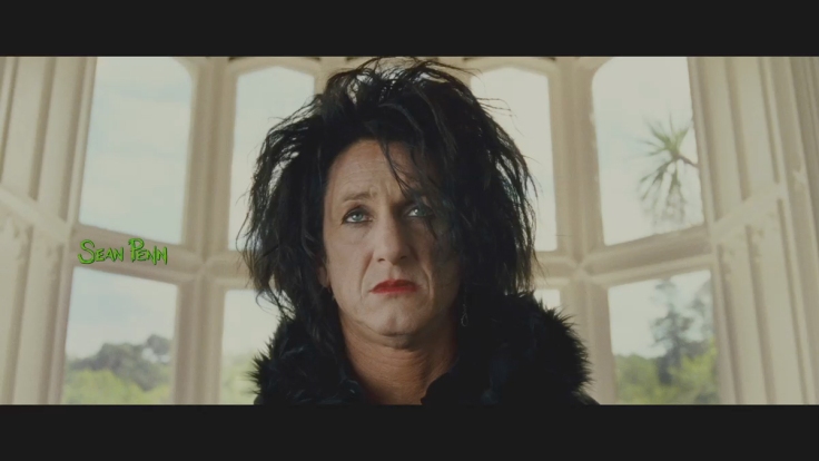
The first time I met him, he and his team were in Room 4 checking my titles. After few seconds watching the green names over the opening sequence of ‘This Must Be The Place’, he stood up and with his roaring, Neaples-accented voice, screamed a long series of badwords to us.
Us: me, my art director, the producer, the planner, the client assistant, the colorist, our white, old-fashioned chemical lab suit (nostalgic memory of the good ol’ times when the firm used to develop and print only), our CEO, our new logo, and every carbon-based lifeforms within a mile.
What was happened? We didn’t accomplish our impossible target. Mr Sorrentino wanted for his movie – the bitter story of a ex-80s rockstar in search of answers about his life – electric-green titles. He loved some tests drawn on paper by a producer assistant with a highlight marker. He loved them even more when they were on an Avid monitor. He didn’t loved them on screen in our Room 4.
This is a typical color issue when trying to match digital colors and film colors. Electric, saturated, overexposed colors – in one word, typical colors of the 80s – are hard to be created on film.
Mr Sorrentino asked us the impossible. It’s not a matter of trying hard, neither a question of skills – I am talking about creating the technically impossible. Film can reach a bit depth that digital supports can not, but digital colors – created on a pc, checked on a linear monitor – are sometimes impossible to be transferred on a logarithmic print. We have spent the week after that horrible matinée looking for a solution.
Even if my work was not the color affair – in detail, I was asked to scan and digitalize the sketches in Illustrator, create a brand new, working font, write with the most bright green possible the cards and check the editing – I was as pissed off as our colorists were about it. We tried any green hue value printing tests after tests. You know, another error was not an option. And prints are a little expensive. Correction: prints were a little expensive.
A very good expert in color grading reached a very good solution that was a life lesson for me. He broke the rules as Captain Kirk. He asked me to give him linear titles – that means turning off the logarithmic conversion and say a prayer. It’s like suggesting a friend to play chess with a wookie with standard rules. He put my linear titles on a logarithmic film and it worked.
The giant firm which was born one century ago, the place where the color film was first created, became the place where people had to forget the science and solve a very uncomfortable problem by genius and imagination. It is not by accident that this story happened in Italy.
Technicolor Creative Services Rome is now closing. The Film Department has already closed two years ago due to the international film crisis. Clearly, the Digital department where I used to work is considered from the French central office not useful. There are economical issues that as a former Technicolor guy I cannot understand. I can only say with disappoint that international experience and Italian creativity came together in that place. Technicolor Rome oversaw the color timing and the digital intermediate of Sorrentino’s masterpiece. It means that a part of that Oscar® goes to those professionals that were my colleagues.
I quit one year ago. My last work was creating the end titles for ‘The Great Beauty’ – end cards and end roll. Even if I must confess you that they are not my best titles, today I feel honored to have given my small contribute for the success of this movie. It’s a small victory for me, and a great victory for Mr Sorrentino and for the Italian motion picture industry, but it’s a bitter victory because Italy has left an incredible team that today cannot join the party.
(This article was kindly edited by Diana Alliata, English Teacher – http://soundswords.yolasite.com)


